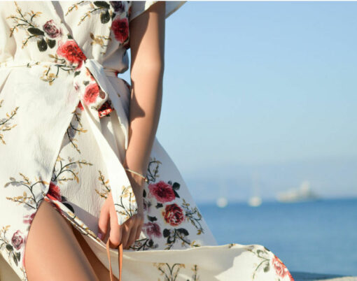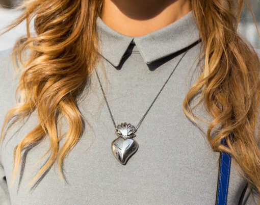


Rose gold is having its moment. It’s feminine, pretty yet still subtle against the skin.
We saw that yellow gold made a comeback in the fashion world thanks to designers such as Moschino and D&G, but it’s now time to make way for the pinky hues of rose gold. Michael Kors kick started the trend, infiltrating the blogosphere. But the slightly copper, rose tinted metal has made waves not only in the jewellery and watch industry; Apple also jumped on on the hype, introducing a new Rose Gold colour to the iPhone 6s and even Adidas’ Stan Smiths made a rose metallic version.
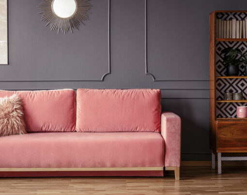
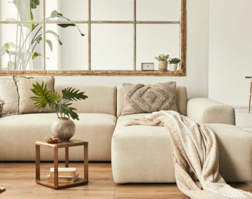
As we see it spread through the fashion world it also started trickling into interior design. The long awaited Pantone’s ‘Colour of the Year’ announcement didn’t fail to disappoint as this year they chose two colours, Rose Quartz and Serenity (a warmer rose complimenting a pastel blue), which came as a surprise to interior designers due to the infant tones associated with the colours. The key when styling these colours within the home is to keep either of the colours in one strong dramatic feature (like a tile splash back, or wall) or to have small pops around the room styles as an accessory.
So why has the metal rocketed into being the must have jewellery accessory of the year? The coppery blush tint is more youthful than yellow gold yet still muted and understated at the same time; no wonder it has become so popular. As one of the warmest metals, it makes for a flattering jewellery metal for all skin tones and therefore very versatile on anyone.
If you want the jewellery or watch to stand out, style the accessory with colours such as navy and black to make the metal pop and be worn as a statement piece in your outfit. If you’re worried the metal is too girly for you, pairing the jewellery with masculine colours is a great way to tone down the feminine hue. Don’t be scared to mix and match metals either – layering gunmetal accessories with rose gold will give the jewellery a cool, contrasting look. In the home, the key when styling these colours within the home is to keep either of the colours in one strong dramatic feature (like a tile splash back, or wall) or to have small pops around the room styles as an accessory.
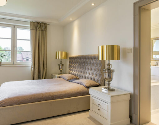
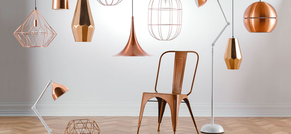
Unlike last year when we saw bright colours dominating homes, this year it is all about quiet and calming shades in interior design, which is portrayed in Pantone’s two ‘Colours of the Year’ we mentioned above. Copper is a huge trend in home ware and is a great metal to use in lighting, tables and even tiles. Lighting is a perfect way to introduce this trend into your home, with many copper lamps and floor lights on the market. Adding copper into your home gives a nod to that industrial chic we are seeing throughout interior design especially in kitchens and bedrooms. If you wanted to push the metal trend a little further, copper is an antimicrobial material, stopping the growth of bacteria which makes it a perfect option for a bathroom or kitchen countertop.
Image credit: Oski and Fig